
Today I wanted to share a project I made over the weekend. This is something completely different for me but it was fun to learn and now I have even more reasons to purchase beads!
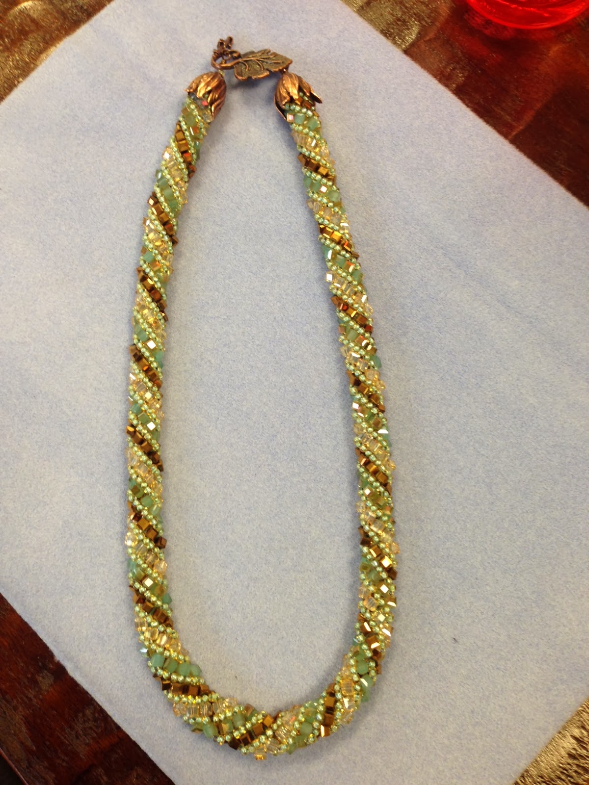
This necklace was beaded by me in about 5 hours start to
finish. The pattern is called the
Russian Spiral and for the style I made it requires 3 different colors of
square beads and 1 color of seed beads. It was fun and I am still amazed that I made
it!
I am definitely hooked. This is something I can do while sitting
with my man while he watches TV. I have a hard time sitting still for too long
but I can sit still for this. Win-Win!

Here are my and my friend’s necklaces. Only one square bead and
the seed bead colors are different yet they look completely different from each
other. What a difference the color choice makes.
Obviously, color choice is huge! This is true in all artsy
and craftsy things. While sitting in the
bead shop this weekend there was one statement I head over and over and that was:
“I am terrible at picking colors”. I
heard this from about 2/3 of the people who were shopping in the store that
day. Luckily the store has some fantastic people who work there and are happy
to assist.
Color frightens people; however, it doesn’t have to. There are many ways to choose colors for
projects.

Color Wheel from Dick Blick Art Supply
First off is the trusty color wheel. This is one of the color wheels that I have. If you have never used one I recommend going to an art supply store and have them give you the run down. A good color wheel will help you see how the colors work together as well as why they work together.
Another way to put colors together is to visit the Pantone
website. This is a fabulous site used by designers of industries worldwide.
They are the world wide leaders in the color industry and if you want to see
the trending colors for the year they are the place to visit. www.pantone.com Once you visit their site you will really begin to notice the trending colors everywhere!!

Picture from All Things Shabby and Beautiful.
Click Picture to go there
Still another great way, this is one of my favorites, is to look at color combinations that you like in magazines, on Pinterest, on websites, etc. If you see a jewelry setting, floral design, painting, room décor scheme etc. that speaks to you, look at the colors the artist/designer used. There’s your color palette. You already know you like the way the colors work together all you need to do is take that picture with you and match away with you chosen medium. In the image above you have the stunning color combination of purple, green and brown. They work great together in nature.

From The Little Pea Boutique
Click on photo to go to Etsy Shop

From Blume And Jensen
Click on photo to go to Etsy Shop
The images above are using some of the same colors as the picture of the bench in the garden. Hopefully you can see the potential in using pictures for color selection. I think I'll be taking all three with me next time I got to the bead shop!
I am pretty sure I’ll be learning more beading techniques
since I had such a great time with this one. Beading adds so much to so many
items. The faerie I am working on will have some bead work on her outfit. It
makes the outfit go from cute to WOW!
Hopefully I’ll post some pictures of that soon
Have a great week
Beautiful beadwork - can't believe how fast you whipped that out! And color DOES freak out quite a few people...me, included. I can pull fabrics together for quilts, all day long, but try and translate that same ability into teeny little beads and it's a whole different story. I will stand in front of a bead wall for hours, and second guess myself. Great ideas for help (I do own a color wheel that has come in handy more than once). Happy Creative Monday - Tanya
ReplyDelete